top of page
OMUSUBI

YEAR
2024
PROJECT TYPE
Branding
DISCIPLINE
Logo
Package
Illustration
YEAR
2024
PROJECT TYPE
Branding
DISCIPLINE
Logo
Package
Illustration
OVERVIEW
OMUSUBI is a riceball restaurant based in Los Angeles, inspired by the quick and healthy offerings of Japanese convenience stores. It aims to provide an easy, nutritious, and delicious food option that fits the fast-paced lifestyle of LA while introducing the charm of Japan’s most popular grab-and-go item—riceballs.
In Los Angeles, finding food that is both quick and healthy can be a challenge. Many fast-food options lack authentic cultural flavors, making it difficult to introduce riceballs in a way that feels approachable and familiar to a diverse audience. To address this, I designed the OMUSUBI brand to be friendly and accessible while reflecting an authentic Japanese vibe with a cute, pop-modern aesthetic.
OMUSUBI is a riceball restaurant in LA, inspired by Japan’s convenience stores. While LA offers many fast-food options, finding something both nutritious and culturally authentic can be a challenge.
To introduce riceballs in a way that feels approachable, I designed the OMUSUBI brand to be friendly and accessible while staying true to its Japanese roots, using a cute, pop-modern aesthetic that blends tradition with a fresh, inviting look.


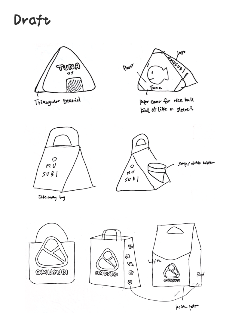
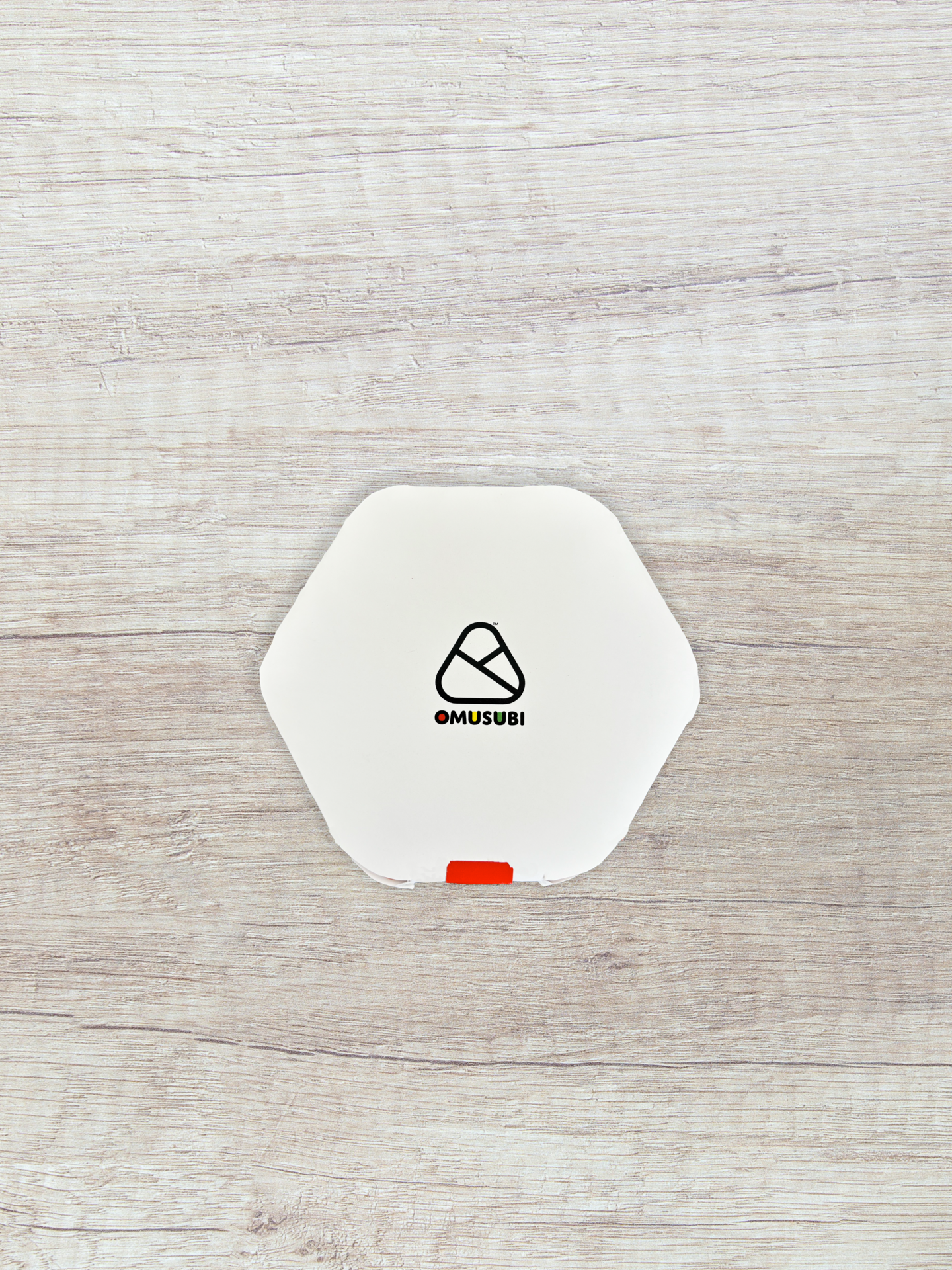
LOGO
I explored different ways to represent the triangular shape of riceball, experimenting with various design approaches. In the final version, I incorporated a wrap around the triangle, inspired by the packaging commonly found in Japanese convenience stores.


COLOR PALETTE
Inspired by Japanese culture, Shrine Red and Sakura Pink remind us of shrines and cherry blossoms, while Kintsugi Gold and Fuji Purple express craftsmanship and nature, where simplicity and tradition meet.


PACKAGING


PRINT COLLATERAL
As rice balls are still not well recognized in the United States, I designed a lively and convenient menu where customers can easily locate their preferred flavors. The menu is a simple "Flavor Finder" in which customers answer just three questions and are guided to a recommended flavor based on their response.
Each flavor has a description and suggested side dishes available for it, thereby making the dining experience easy and convenient for first-time customers. The layout not only simplifies the choice-making process but also introduces Japanese food in an interactive way.
Since rice balls are still unfamiliar in the U.S., I created a simple, interactive “Flavor Finder” menu. Customers answer three quick questions to discover their recommended flavor, with descriptions and suggested sides to make ordering easy.


STORE


TYPOGRAPHY
For typography, I selected Domus Titling and Halcom because of their round and friendly forms. Both fonts convey friendliness and modernity, which complements the brand's friendly and comforting personality, much like the rice balls themselves.


ILLUSTRATION


MORE WORKS

GOODGIRLFISH
Brand extension for wine brand

knekt
Branding for credit card
GOOD GIRL FISH
Brand extension for wine brand

knekt
Branding for credti card
bottom of page